Local Magazine Website Redesign
Each Homes & Land territory has their own enterprise-level website containing local real estate inventory and a wealth of other resources. The publishers of each magazine have the ability to customize certain aspects of the site and provide resources to their advertisers. The last redesign of these sites was done in 2008 and they were in desperate need of a facelift.
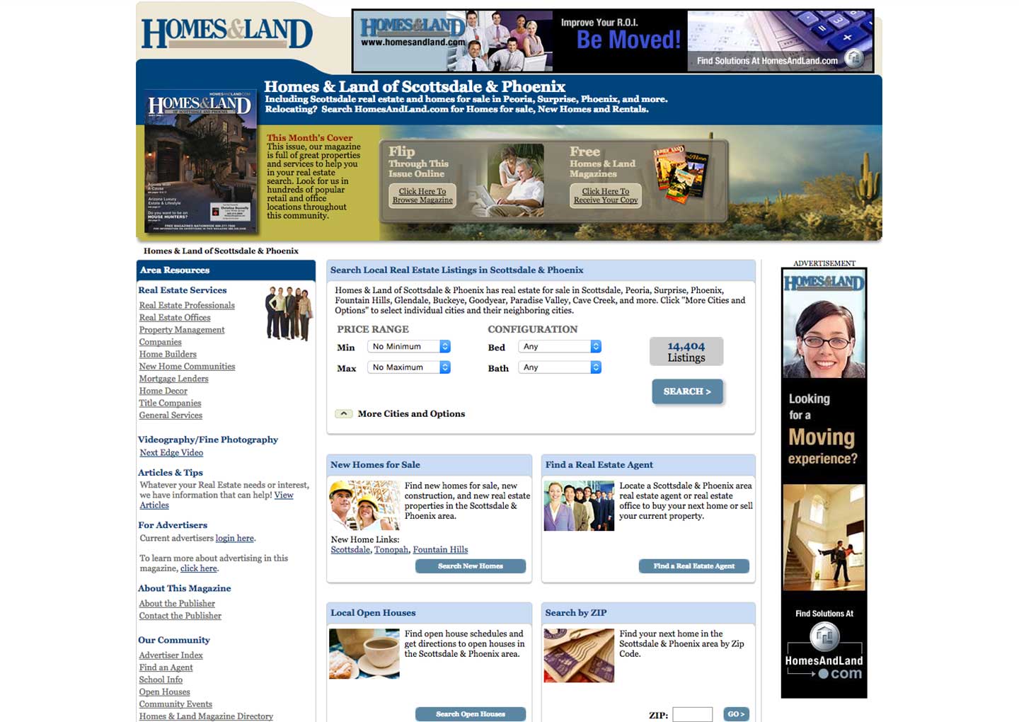
Old version: Last redesign circa 2008.
The first step was to attend a series of publisher-composed committee meetings to derive what they wanted from their new websites. Aside from a new UI, a few things they wanted were Improved search functionality, Greater Open House visibility, better Advertiser (Real Estate Agent) profiles, and more social integration.
Making these sites 100% responsive was top priority of mine. To that end, I designed everything from the very first wireframes at the smallest viewport size only to make sure we could account for every feature we wanted on all devices. Every high fidelity mockup would start at the iphone 5 size until complete and approved before I moved on to the desktop or any larger breakpoints.
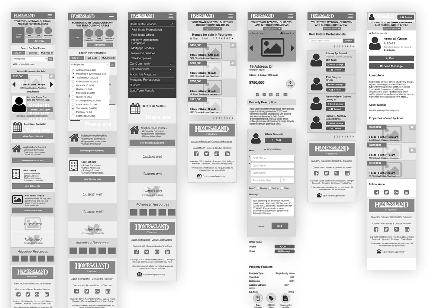
Initial wireframes were all done at the smallest screen size
I started by designing the 5 most “involved” and complicated pages to set the tone of the design. These were the Home Page, Listing Results Page, Listing Detail Page, Agent Results Page, and Agent Detail Page. The idea behind the new design was to go bigger, bolder, cleaner, and more organized. The results are a much more friendly UI with drastically improved UX in the most important areas.
As we neared closer to creating sprints for development, we realized we needed to step back and create a page inventory to make sure all current views were represented in the new design. We uncovered several views that we had not accounted for previously, and with the new inventory in hand I began mocking up all new views.
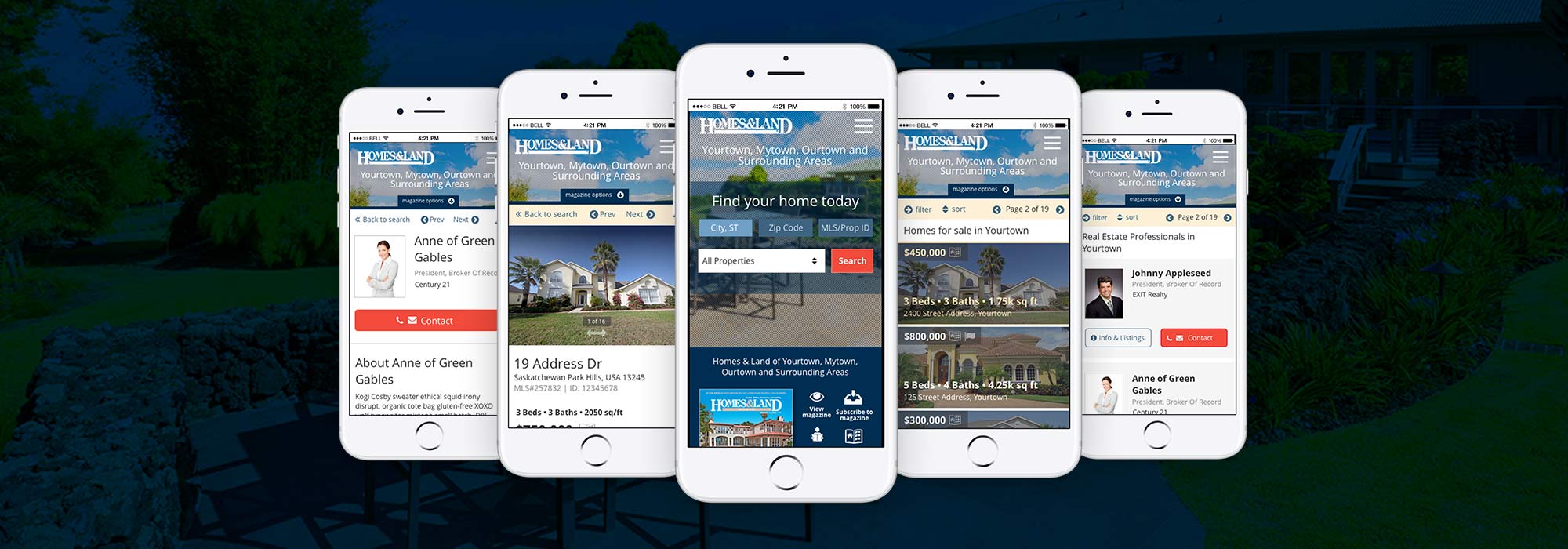
Mobile mockups
It was important to me that the codebase was as clean as the new design, and that we all followed the same naming conventions when writing the HTML and CSS. After hours of research on this topic, I decided that the BEM naming convention was built on strong reasoning and has the support of many of the industry leaders. Despite my hesitation in the past, I committed to this new structure and dove into the documentation.
In addition to the new naming scheme, after discussions with other developers, we decided to use a paired-down Bootstrap 4 framework to scaffold the front-end. The new grid system fit in perfectly with our mobile-up approach, and the new integration with SCSS was the direction we wanted to move to.
Before development on any pages began, I created a living style guide that would contain pertinent style information and ready-to-use code snippets for the developers. The style guide contained typography information, color variables, buttons, icons, errors, and other element design.
To keep the style guide up to date with the site (and the site up to date with the style guide) we came up with a shared build system that uses the same SCSS partials to populate the style guide and production site. This way the style guide and production sites would never diverge.
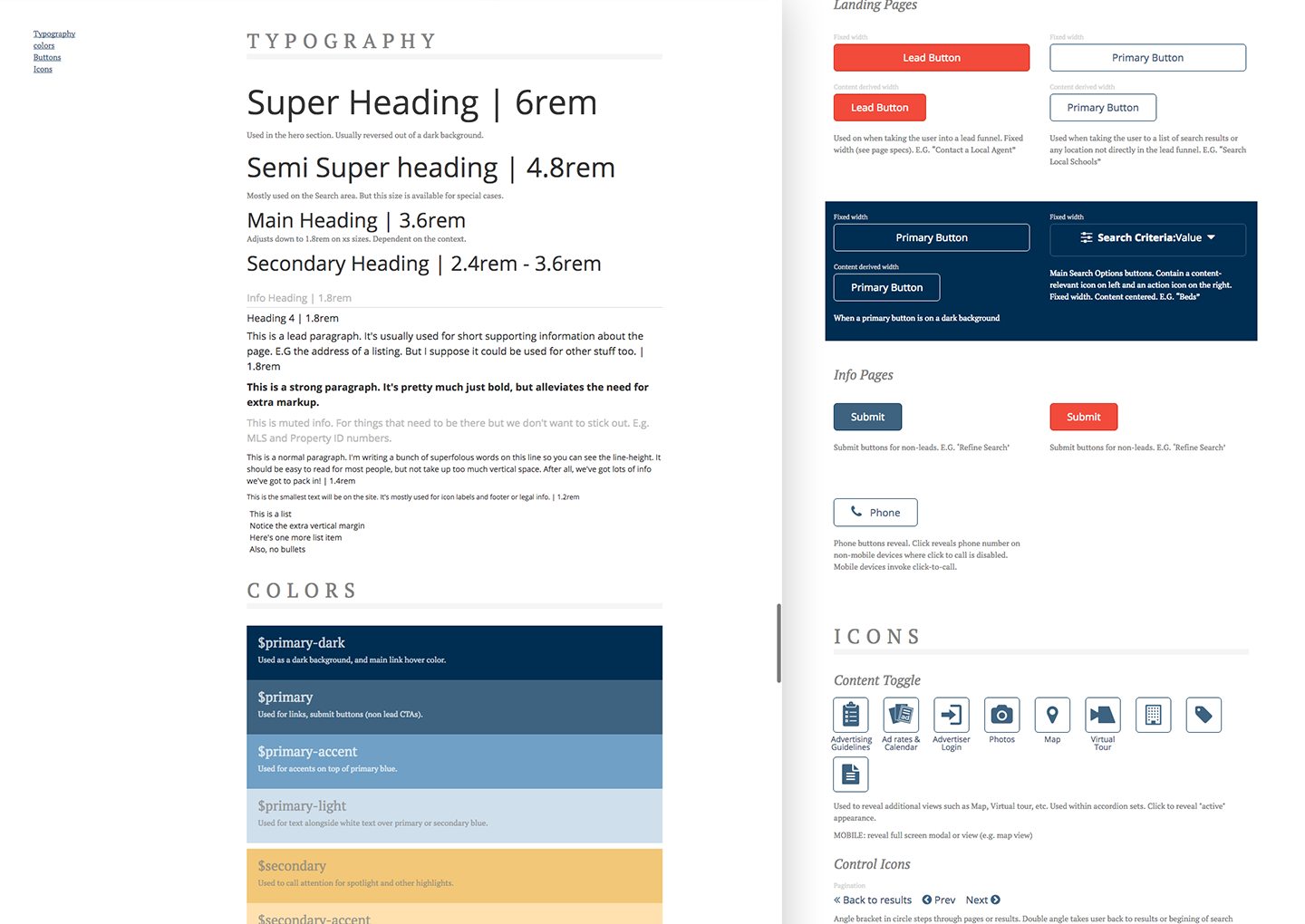
Live Style Guide
A major prerequisite in this project was that we needed to limit the scope of new features as much as possible as part of the initial redesign. That being said, adding more branding control to publisher controls -- especially the ability to choose different themes for the site -- was a must.
By carefully choosing color schemes that mirrored each other in terms of lightness and contrast, I was able to give each color a variable an associated name, e.g. $primary-dark (used for backgrounds, buttons, etc), $action (used for calls-to-action and areas of great emphasis), etc.
By carefully choosing and naming each color accordingly, we were able to have multiple color schemes that interact with each other harmoniously. For example, the dark blue that’s used as the background of our default color scheme could be replaced with a deep red in our “hot” color scheme without affecting the colors it contacted. This meant that by replacing the values of color variables in a single SCSS partial, we could create an entire new theme from top to bottom.
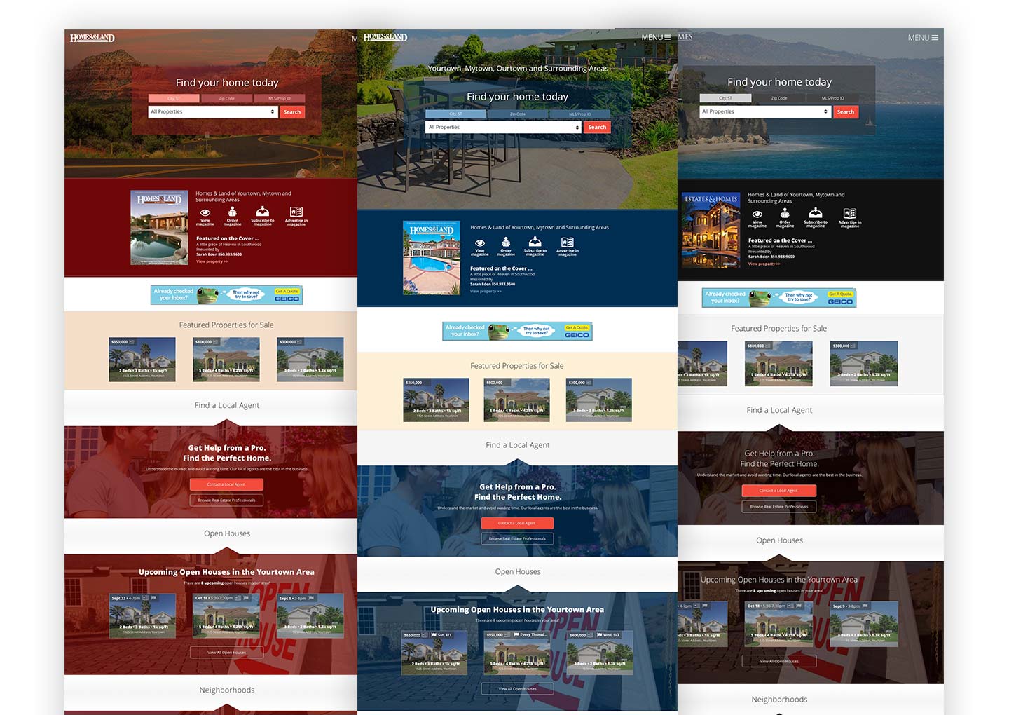
Changes to one tiny SCSS file creates mulitple new themes
This project is currently in the development phase with the plan to roll out early 2017.
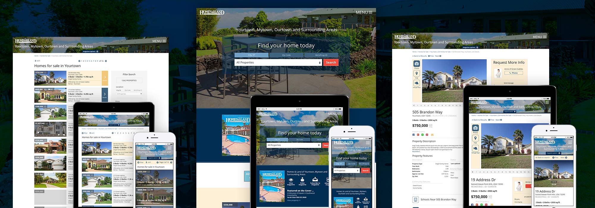
Final design screens
Six years later, the franchise websites are still in use and regularly updated.
Take a look at some examples: