Dashboard and Analytics
Bloom Intelligence helps restaurants, gyms and retailers attract, engage, and retain customers with powerful Wi-Fi marketing and analytics.
When a customer logs in to WiFi at a store, they are greeted with deals, offerings and the ability to connect with the business on multiple social sites. While this is great for the customer, the data collected by the businesses within this process is extremely valuable.
Bloom Intelligence came to me with rough plans for a “dashboard” to display and help business owners quantify the data they collect from their customers. The goal was to clearly display the metrics collected by the service in snapshot-form to multiple levels of management with varying technical skill.
The first step in displaying data in a meaningful and digestible matter is to understand what it is and what can be concluded from it. I sat down with the creators and developers to help categorize the types of data, and to attach real-world scenarios to both the collection and results of these metrics.
What this manifested itself into were use cases that helped align who we were designing for.
Example use-case:
When Bob logs into the dashboard he sees that in the past 30 days he’s had a total of 2,300 visitors and 6,300 passers-by. This means that the average capture rate of potential customers within the vicinity to actual visitors was 36.5%, which is up 10% from the previous 30 days.
He also knows that there was an average of 43 new visitors per day, an increase of 6% from last period. Amy was his best customer, visiting 3 times with an average duration of 32 minutes per visit.
Dashboards can be a highly polarizing and many times disastrous user experience. My goal was to create a UI and presentation that would provide skilled users with all of the data necessary for their success, and also be free from intimidation for first-time users. My plan here was the keep the size of the KPI (Key Performance Indicator) cards as uniform as possible to avoid a bunch of graphs and numbers competing for your attention at different sizes.
One of the requirements of the design was that it would be built using the AdminLTE framework. It had to be customized to fit the brand, but done so in a way that minimized unnecessary custom CSS in development.
From this came a series of wireframes that set the tone for the metric displays and the hierarchy of the information, while leveraging AdminLTE’s framework.

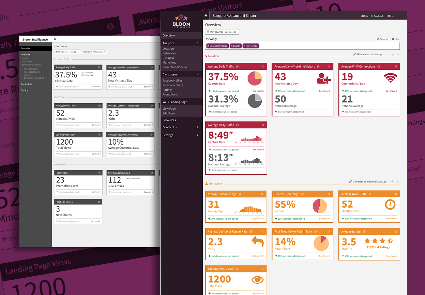
Initial wireframe and early design
The feedback on the first designs were that they wanted to lead with charts instead of integers wherever possible, and that the colorful nature of the cards was a little jarring. I agreed with the feedback and began redesigning.
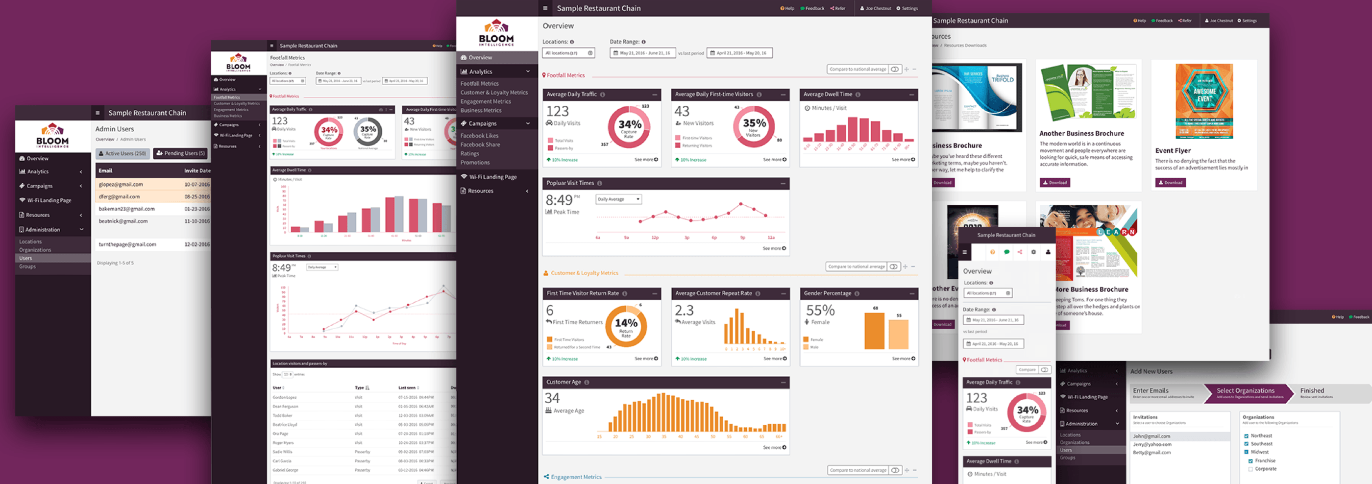
Over several design iterations, charts, colors and user-flows were perfected to best organize and display the metrics.
Using InVision prototyping software, all stakeholders were able to walk-through and comment on a typical user flow prior to development.

Final design screens
Once the design was set, I prepared the designs for handoff to the Bloom developers by including behavioral and style notes directly on the prototype using InVision. Where applicable, I even provided AdminLTE and Bootstrap class names along with custom CSS snippets.
After a couple short weeks development was able to begin while we continued to collaborate on additional views and functionality.