A unified design language for Fourth Products
After HotSchedules and Fourth Enterprises merged in the summer of 2019, the newly combined entity instantly boasted the most comprehensive suite of hospitality management applications on the market.
The problem was that most products in this new portfolio had drastically different interfaces and usability patterns.
While historically, both companies had functioning UI component libraries and some style documentation, both had varying levels of immaturity and scant coverage among the products in the greater portfolio. It was quickly apparent that any effort to unify the experience of our suite would be challenging and expensive.
Secretly, we set out to do precisely that.
Forming a small UX operations team (which I was not yet on), design leadership paired two designers and a front-end architect together to create the beginnings of a design system that would scale across design and engineering teams. They set the visual design and created a collection of React components using Uber’s Baseweb framework. The team was ready to socialize the workings of this semi-covert mission to the organization.
It was at this point that I was asked to lead this initiative.
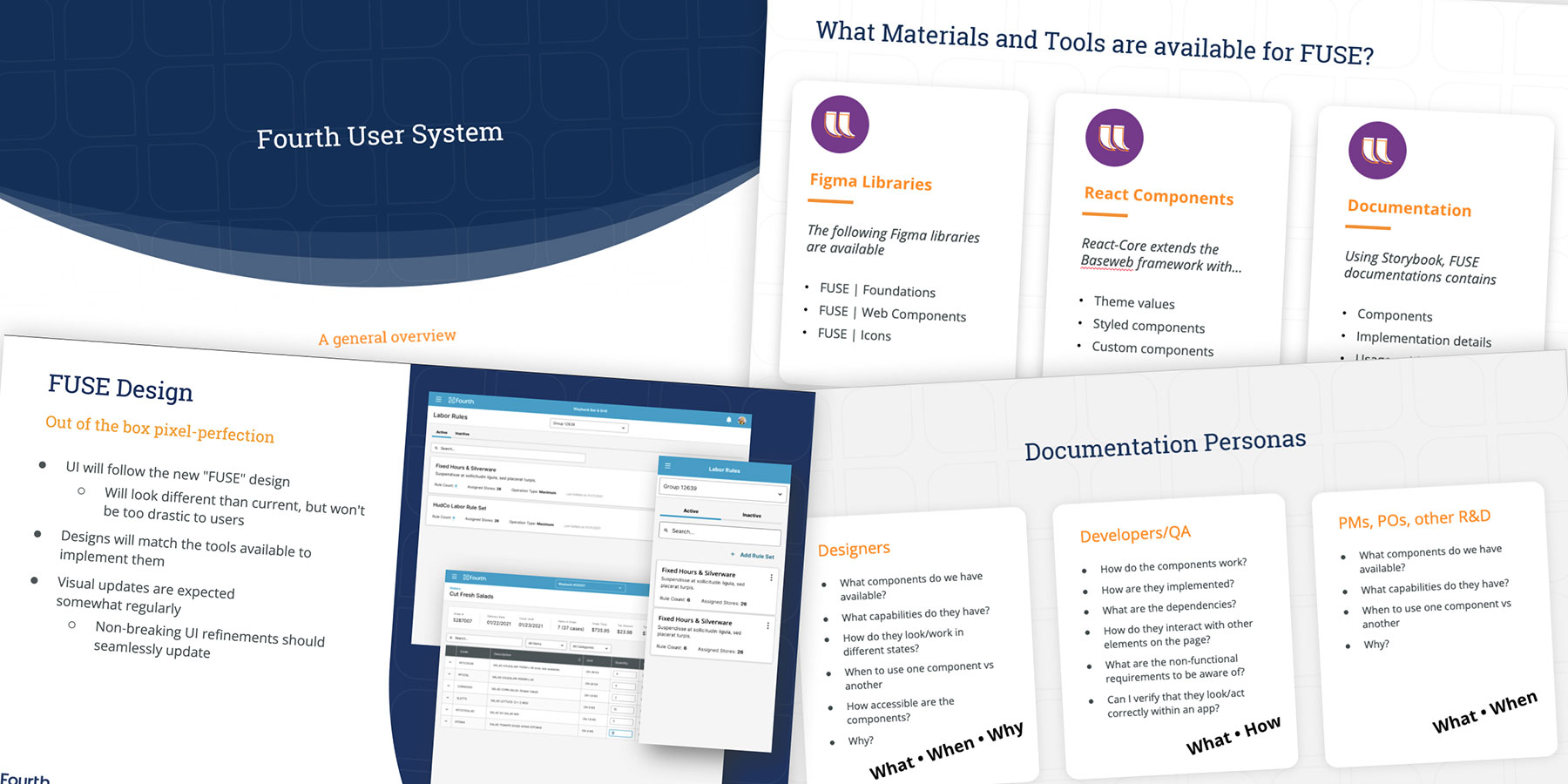
Even a perfect design system is useless if no one is consuming it. One of the first initiatives I started on the project was an outreach campaign with Product and Engineering teams to evangelize what we were building in FUSE and set expectations about when and to what extent they could begin to use it.
We had to tow a fine line between building excitement and over-promising. We were still a small team and understood the implications of becoming a blocker in a development cycle.

Slides from internal outreach presentations
Before I joined the project, the team had designed most of the FUSE components in a vacuum. Now that the project moved from theoretical to confirmed, we had to test and improve our components for use in production.
Much of my role became prototyping components in common usability patterns to test their viability and to define those patterns where they didn't exist.

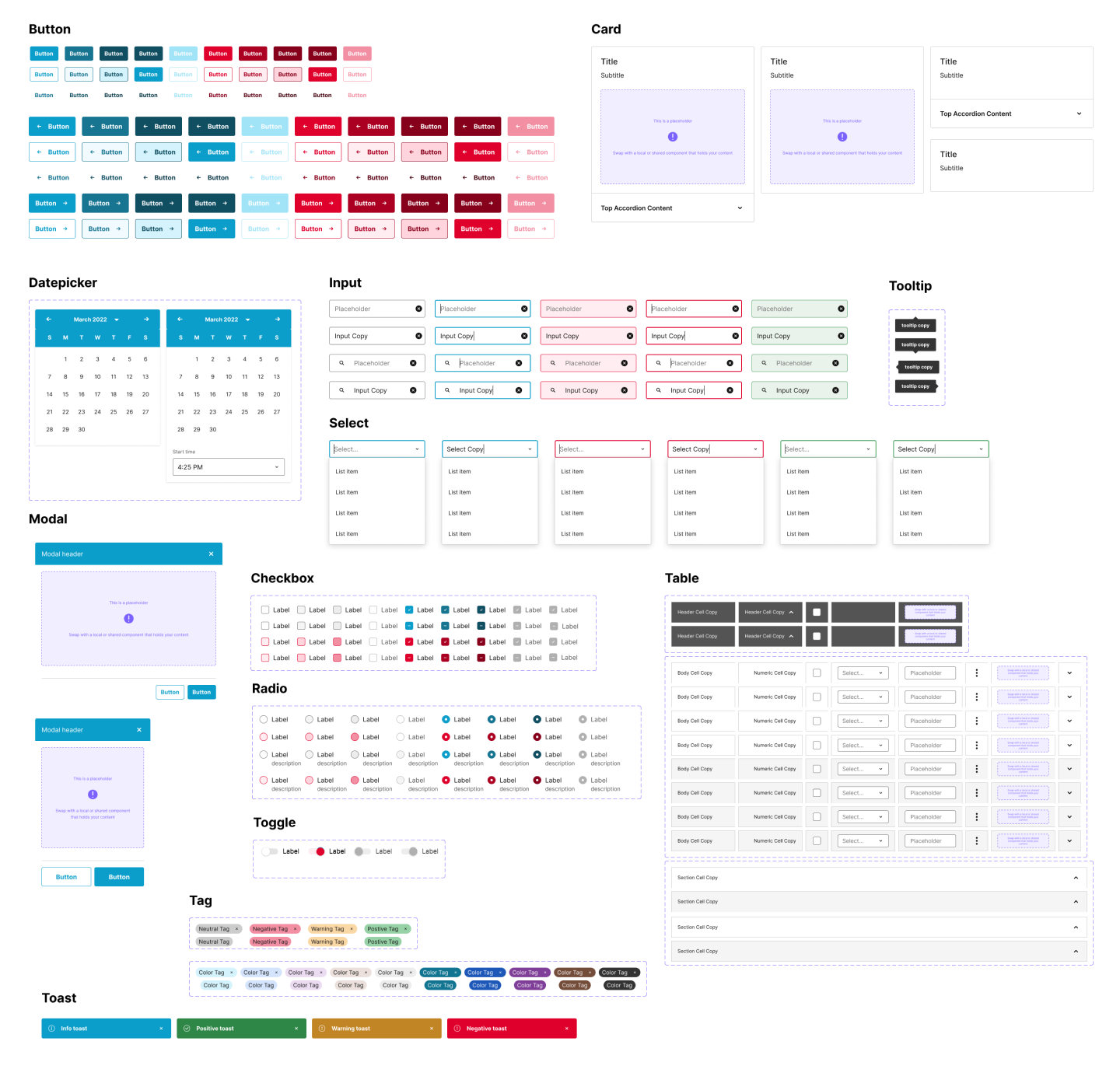
A sample of FUSE components in Figma.

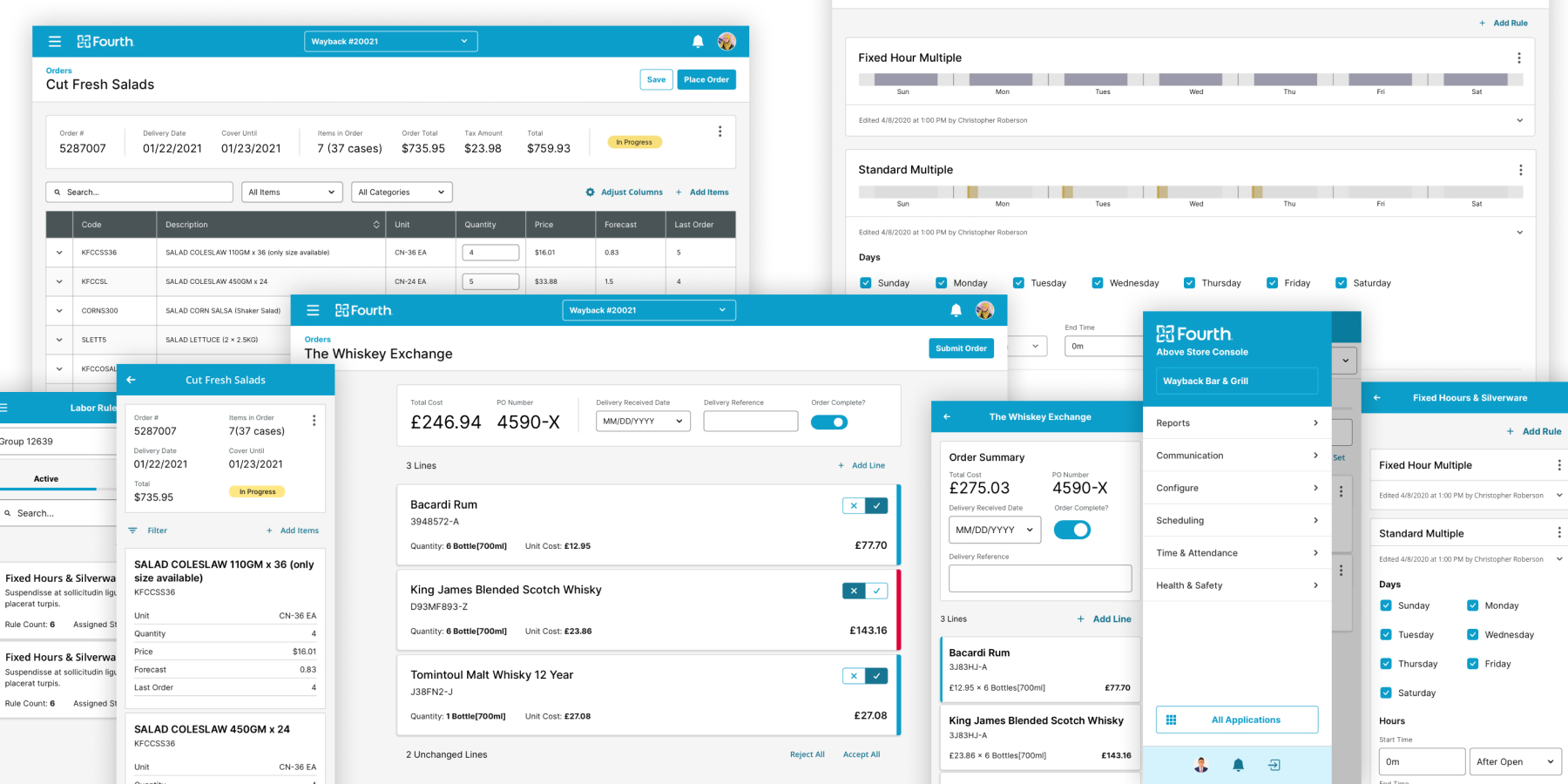
Several different Fourth products redesigned using FUSE representing the “future state” of our portfolio.
The Design Organization at Fourth had 18 members, split across 5+ teams, servicing more than 10 products with different User Interfaces. If FUSE was going to unify the UI components and design patterns across the portfolio, every decision had to be well thought out and intentional, with receipts to back up our conclusions.
My approach to tackling this daunting task was to conduct a multi-step auditing process for each component. For each element in our system, we performed the following actions:
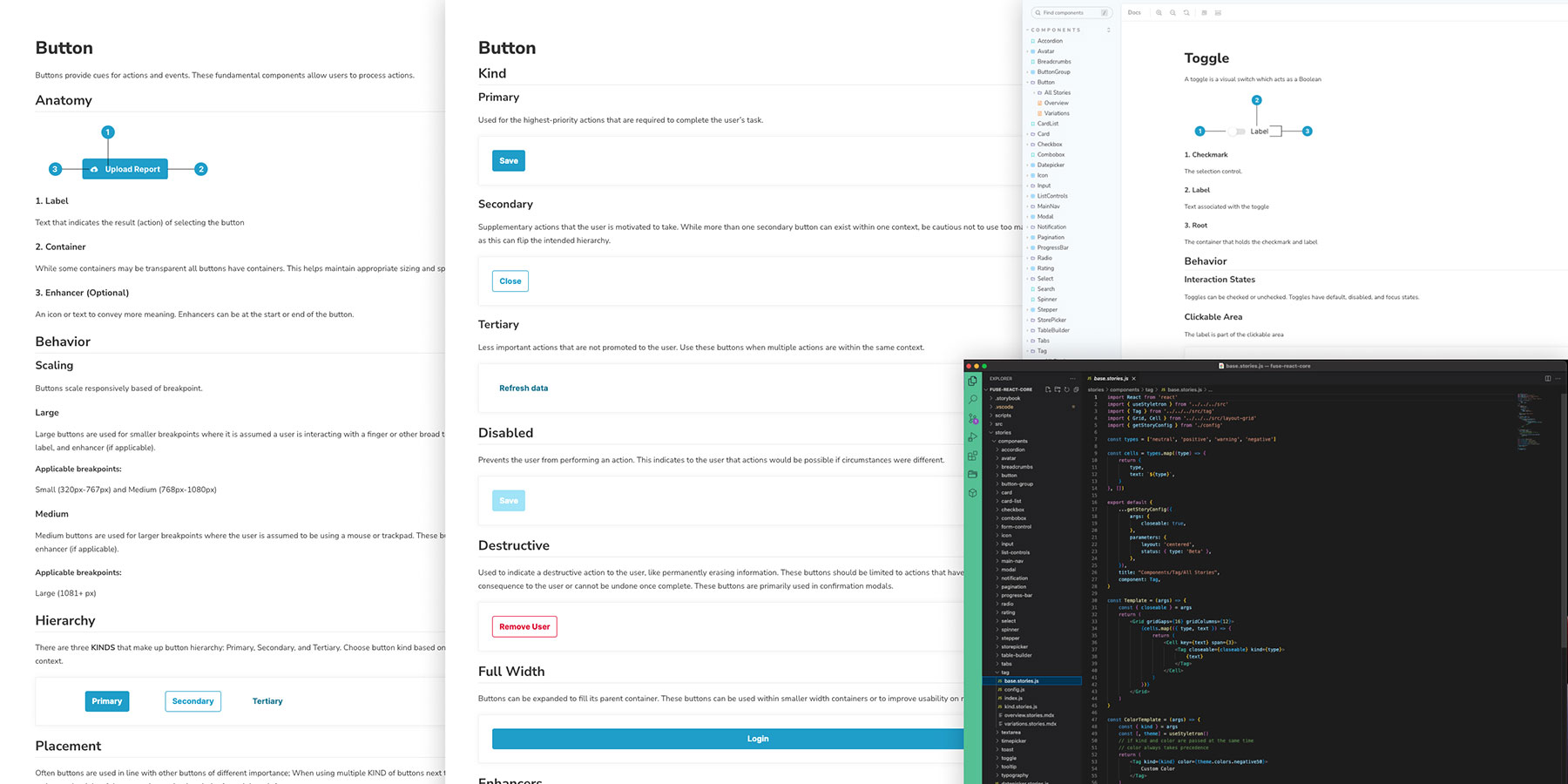
We decided to create our documentation on Storybook, an auditioning development environment with many useful features for spinning up working examples of code in different states and scenarios.
With my background in front-end-development and some extensive training from our front-end architect, I became proficient enough in React to create the “stories” (pages within our documentation).
We decided that each component in our documentation would have the following:

Screens from our FUSE Documentation using Storybook
Over a few months, we successfully implemented FUSE on 3 lightweight applications. With a proof of concept in the books, the organization green-lit the use of FUSE to redesign our newly acquired Applicant Tracking System, PeopleMatter.
Supporting two off-shore development teams with an aggressive timeline put a lot of strain on our team containing only one full-time developer.
After a couple of months into PeopleMatter development, FUSE, as it currently existed, was sadly discontinued due to the dependency it created on feature teams without the ability to scale quickly enough to support the aggressive business goals.
We took much of what we learned from FUSE and pivoted our strategy to create “local” component libraries for each product. More on that here.