Recruiting • Hiring • Onboarding • Compliance
Fourth acquired PeopleMatter and Hiring Manager, one of the preeminent hourly-labor Applicant Tracking and Onboarding systems, in October 2021. The product became a valuable addition to our portfolio as we could now manage the schedule and labor of our customers' employees and help them recruit and onboard new talent.
Despite being a robust and mature product with well-known clients, PeopleMatter lacked innovation and funding before the acquisition. With new investment and resources available, leadership deemed it imperative to show progress to our customers quickly.
The majority of PeopleMatter features were written in the antiquated .NET framework from many years ago. More recently, parts of the application (known as "beta") were updated and built with Angular on top of an API layer.
While a noticeable upgrade from the legacy pages, the beta redesign and development were underfunded and lacked long-term vision and product cohesion. The business decided the best path forward was to rebuild the front-end with React using our Fourth User System (FUSE).
This effort did not go as planned.
FUSE was our well-thought-out but largely untested design system and front-end component library (you can read the case study about it here). While grand in its plans, the speed at which we needed to update PeopleMatter put too much strain on our small Design Operations team.
Furthermore, the visual design of FUSE was based mainly on replicating the five-year-old look of HotSchedules — an aesthetic that some on the PeopleMatter leadership side did not think represented the brand well. After a couple of months of new development and collaboration with the PeopleMatter team, leadership switched strategies and pulled the plug on FUSE.
The new strategy would be to redesign the visual look of PeopleMatter entirely and create a local design system built by the PeopleMatter engineering team.
I would now lead this redesign effort.
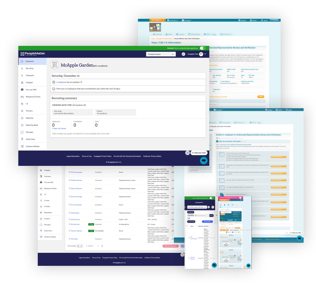
State of PeopleMatter designs at the time of acquisition. Some screens were 10+ years old, others were redesigned recently. None were mobile-friendly.
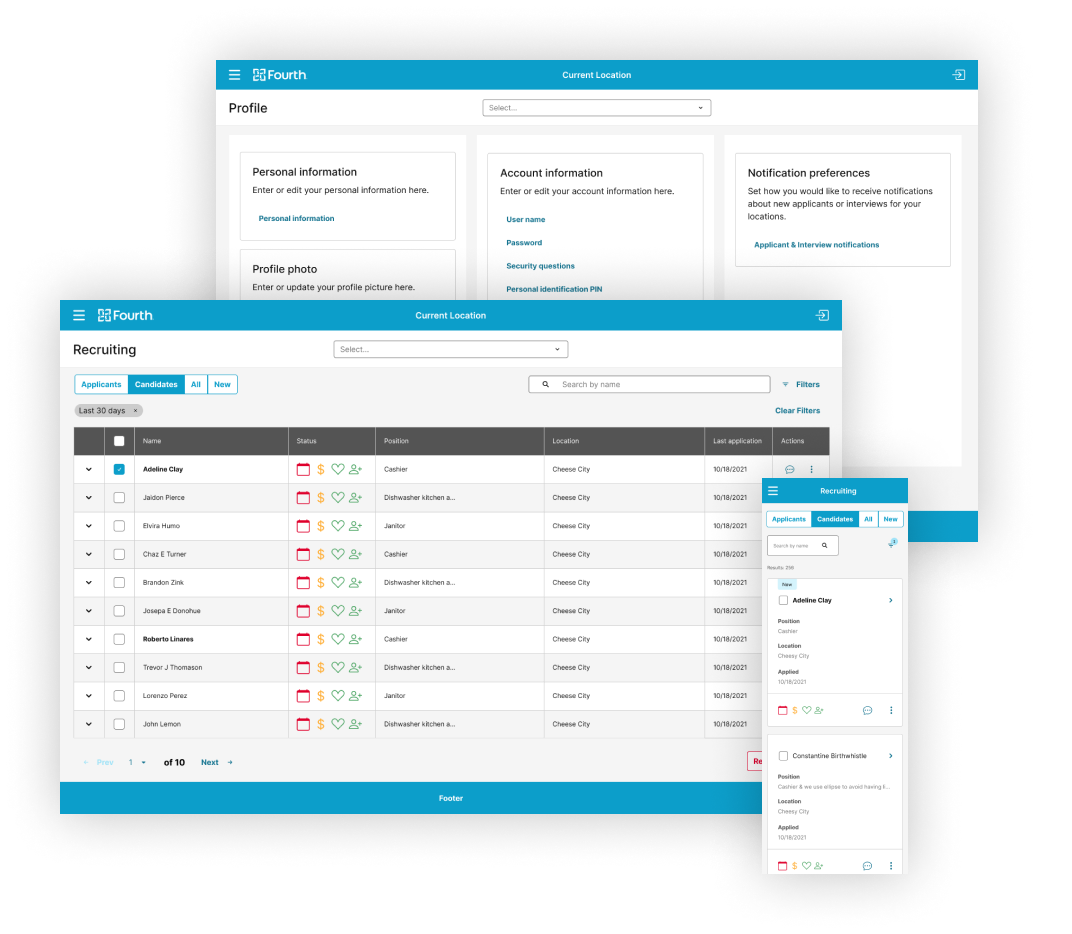
Screens redesigned with FUSE, our design system. The company decided to scrap this approach and start over.

Visual design / Product design
Feature design
Create and maintain Figma libraries
I attributed most of the failures of the initial PeopleMatter/FUSE efforts to a lack of shared expectations and communication. As we were given a fresh start on the project — with the initial success resting solely on my shoulders — I was determined to get all stakeholders on the same page.
I gathered our Chief Product Officer, VP of Product North America, VP of Design and Platform (my boss), and Sr. Director of Engineering to align on the new goals and explain my plan of attack.
My goals for the new PeopleMatter design:
They agreed with the direction. Now, the fun part began.
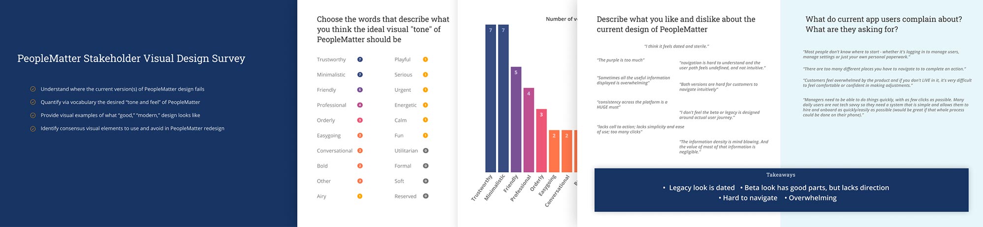
I heard several concerned whisperings from stakeholders during the FUSE phase that the visual design wasn't "modern," "fun," or "exciting" enough. Because visual design is highly subjective, I set out a way to quantify what those terms meant to our stakeholders.
I designed a survey to send to several stakeholders in the project, including executives, engineers, designers, customer success managers, and solutions experts.
I designed the survey to include two sections. The first asked them to provide the following info:
In the second section, I presented five "admin theme" designs from themeforest.net and asked each participant to rate them on a scale of 1-7.
I analyzed the results and brought the group together to discuss.
 View full results summary
With a clear picture of the kind of design that resonated with stakeholders (or at least a clear picture of what did not), I gathered images of award-winning and generally beautiful apps to help fill my subconscious as I began the visual design process.
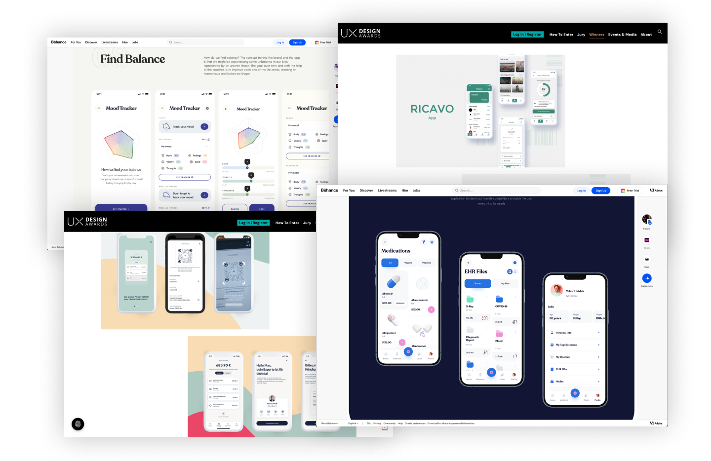
A sample of apps I used for visual inspiration.
To me, the essential attributes that determine the tone of a design are colors, fonts, shapes, shadows, and icons. I set out to define these first, knowing that the rest would fall quickly into place once complete.
My calculous for color considerations:
With this in mind, I browsed hundreds of color palette swatches and ultimately came up with three primary and secondary color scales to test.
I wanted the new app to use two typefaces instead of one to increase visual interest. I researched dozens of font pairings and separated my favorites into Headings and Body options. Ultimately, I leaned on my years of visual design experience to pick my ideal pairing — I like to approach design scientifically whenever possible, but at the end of the day, it's also an art.
I chose to move forward with the somewhat whimsical but elegant, Raleway for headings, and the clean-lined, Lato for body copy.
Creating a custom icon set was not in this project's scope, so I knew we needed to rely on an open-source solution.
My criteria for a winning icon set:
I recently researched and tested viable icon sets for FUSE and determined that Material, Fluent, and FontAwesome icon sets met these criteria. At this point, I made another call that the Fluent icons matched the fonts well and were less ubiquitous on the web, providing a unique aesthetic.
Decision made.
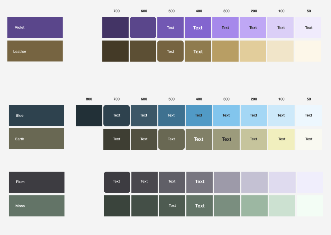
I narrowed down the color options to three different scales.
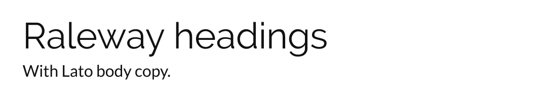
The winning font combo
Screenshot from fluenticons.com
I now had the typography and icons chosen, along with a narrowed-down set of color options. It was time to prototype some screens to see it all together.
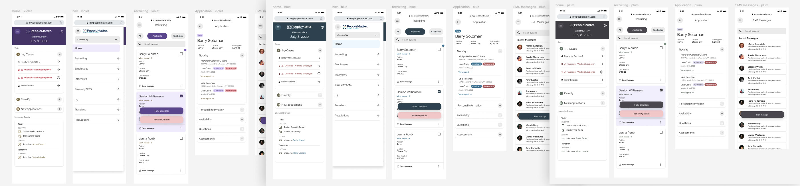
Mockups testing the color schemes with the chosen font pairings
The unanimous choice amongst the decision-making team (myself included) was to go with the violet option. It was vibrant yet professional and garnered the most enthusiastic reaction.
With the theme values primarily set, I took to designing the navigation and page frames — the elements always visible on the screen.
I established a bold primary color background for the navigation on desktop sizes to contrast with the data-heavy body content. I also added an "expand/collapse" option to increase screen real estate when viewing large tables. I opted for a clean white background in the mobile breakpoints where the nav isn't immediately visible.
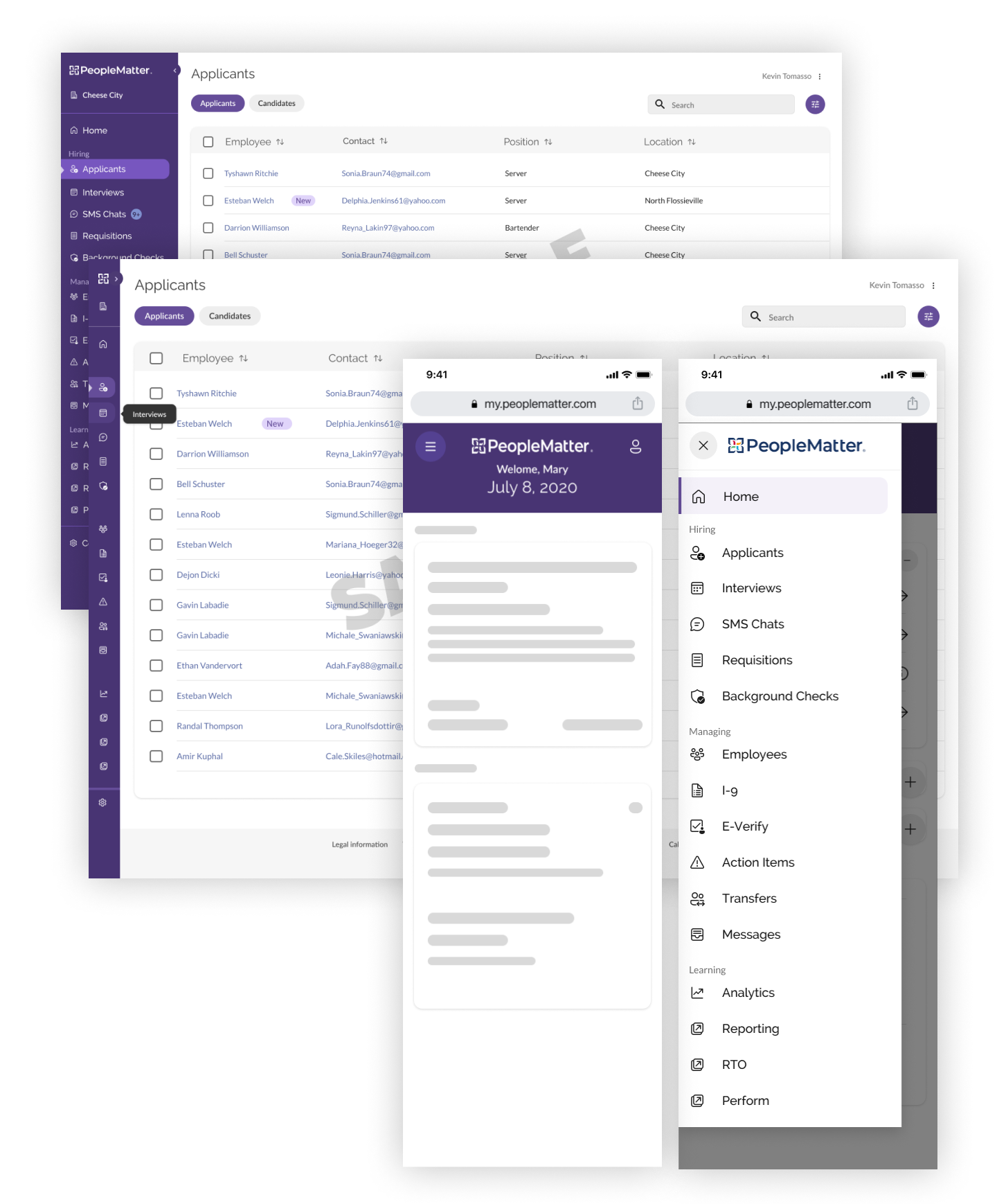
Styling the navigation and application frame
Finally, it was time to apply the theme to the components. Because we had so much experience using Baseweb as the underlying component library for FUSE, it was an easy decision to keep it as the underlying library for this effort.
Working with my wizard Design Operations Technician, we defined the theme values and "overrides" across the entire set of components in a couple weeks. We built the Figma components to mirror the exact construction of the DOM elements in the React components, making handoff for the developers efficient and accurate.
After a couple of sprints, engineering had a critical mass of components developed and a branch of the app live on a QA environment. We had hit our goals and were fully ready to begin working on features.
As I mentioned in the backstory, getting a release quickly in the hands of customers was a cornerstone of the company strategy. We now had a design system from which to build but a long list of features to replace.
In a balancing act with the Product and Engineering teams, our goals were to get to feature parity quickly but push for high-value/low-effort usability wins.
As the design lead, I worked with the two Product Designers to unpack and translate product briefs into logical user flows. Being fully aware of the aggressive development goals, I was calculated and pragmatic when suggesting improvements but held a high bar for quality.
In Q4 2022, we were able to redesign and replace all of the Angular "beta" screens in the product with a heavy and exciting list of improvements for 2023.
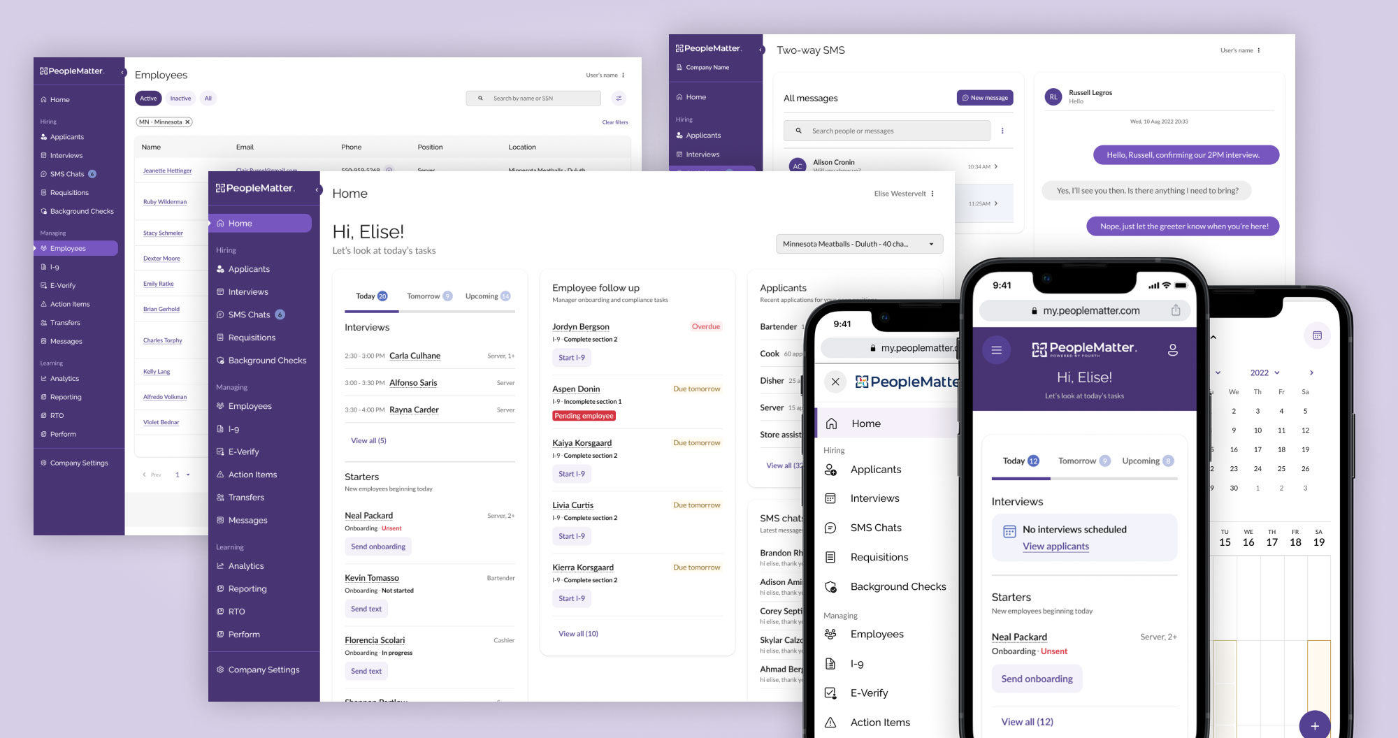
Screens from the PeopleMatter redesign initial release