Home Improvement Blog
Homes & Land needed an online presence for the original content being produced for the nearly 200 magazines in North America. As the new UX/UI designer, they wanted my recommendations and to provide designs to be implemented within homesandland.com.
The project goals were as follows:
The requirements for this project immediately lent itself to building RealTips on the Wordpress platform. Between the requirements, our familiarity with the platform and its robust blogging power, this decision was kind of a no-brainer.
My next challenge was to find a direction for the design. In my experience, there are very few situations where you need to completely design a Wordpress theme from scratch. With this in mind I took to finding a good-looking, flexible, and technically-sound theme on the many theme marketplaces.
Once I chose a theme out of the hundreds I evaluated, it was time to start modifying it to the brand.
Again, with time and efficiency as a factor, I began designing directly with CSS in a personal development environment rather than choosing to mock-up the new look on a PSD. This allowed me to present a working copy to the stakeholders and reduce unnecessary back and forth.
After a few design meetings, we nailed the main landing page UX and categories. Much was removed from the original theme to simplify the navigation and give the presentation a much cleaner experience.
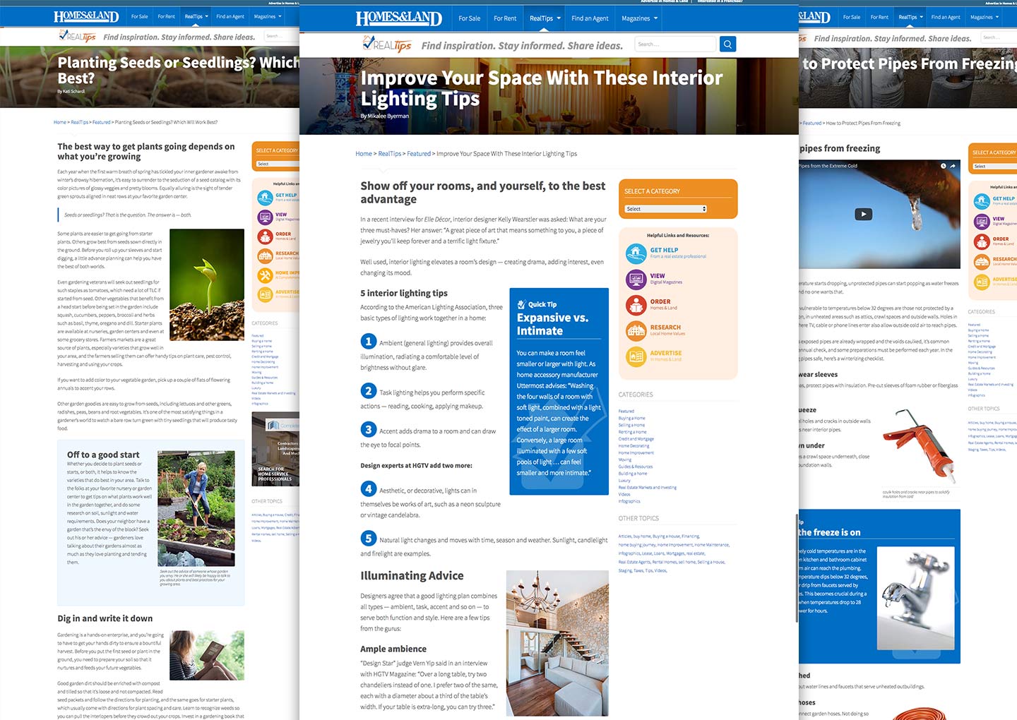
The next order of business was to design the article pages. My goal was to give them a more professional look than your average cookie-cutter blog page, but allow other collaborators to easily employ repeating design elements. To this end, I created a small handful of class names that could be added to provide some design emphasis.

RealTips article pages with reusable style elements
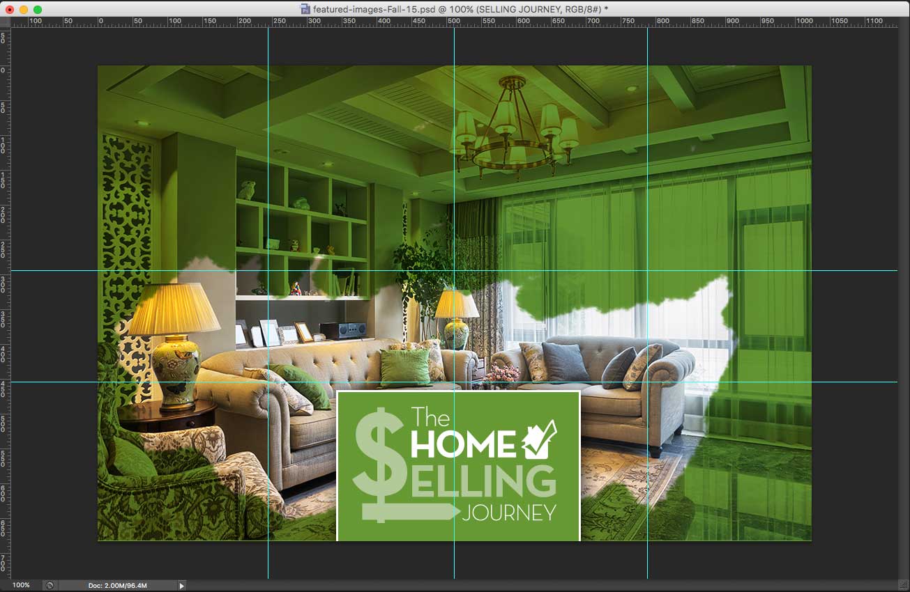
Every good blog posts is accompanied by a strong featured image. I wanted the the featured images on RealTips to actually speak to the contents in article rather than “mail it in” with a generic picture of a house (it’s a real estate blog, after all). Furthermore, the images needed to look good with a 3x4 orientation and also with a long landscape view.
To accomplish this, I created a PhotoShop PSD with guides at different viewpoints to mark each possible view. To get RealTips ready for launch I chose and edited over 150 images. Needless to say, it was a rather large PSD.

RealTips Featured Image template
RealTips has been active and thriving with multiple contributors since its launch, and has become a strong supplement to the overall traffic of homesandland.com.
Visit Site